15 Main Image Strategies to Multiply Your Click-Through Rate
Your main image is the single highest-leverage asset in your entire Amazon listing. It is the only element shoppers see before they decide to click—or scroll past.
Same Product • Same Price • Same Reviews
The 15 Main Image Strategies
Every strategy below is a proven approach to increase your click-through rate. Each one creates a distinct visual impression in Amazon search results—and top-performing brands systematically test multiple strategies to discover their winning hero image.
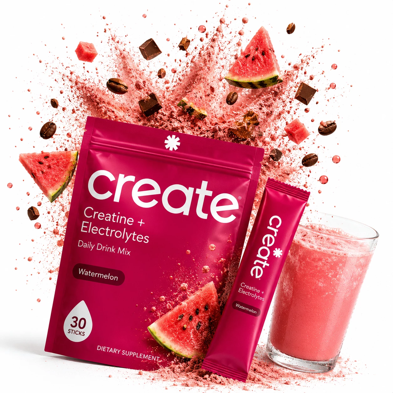
Explosive Powder Burst
Strategy: Pairs the primary pouch with a single stick pack and a freshly blended pink watermelon drink mix. Explosive pink powder, watermelon slices, coffee beans, and chocolate pieces burst out from behind the packaging to evoke intense flavor energy.
Why it works: High-contrast ingredient explosions break through passive scrolling on Amazon search grids. Demonstrating both the raw powder state and the finished beverage in a single hero frame instantly triggers sensory appetite appeal and boosts click intent.
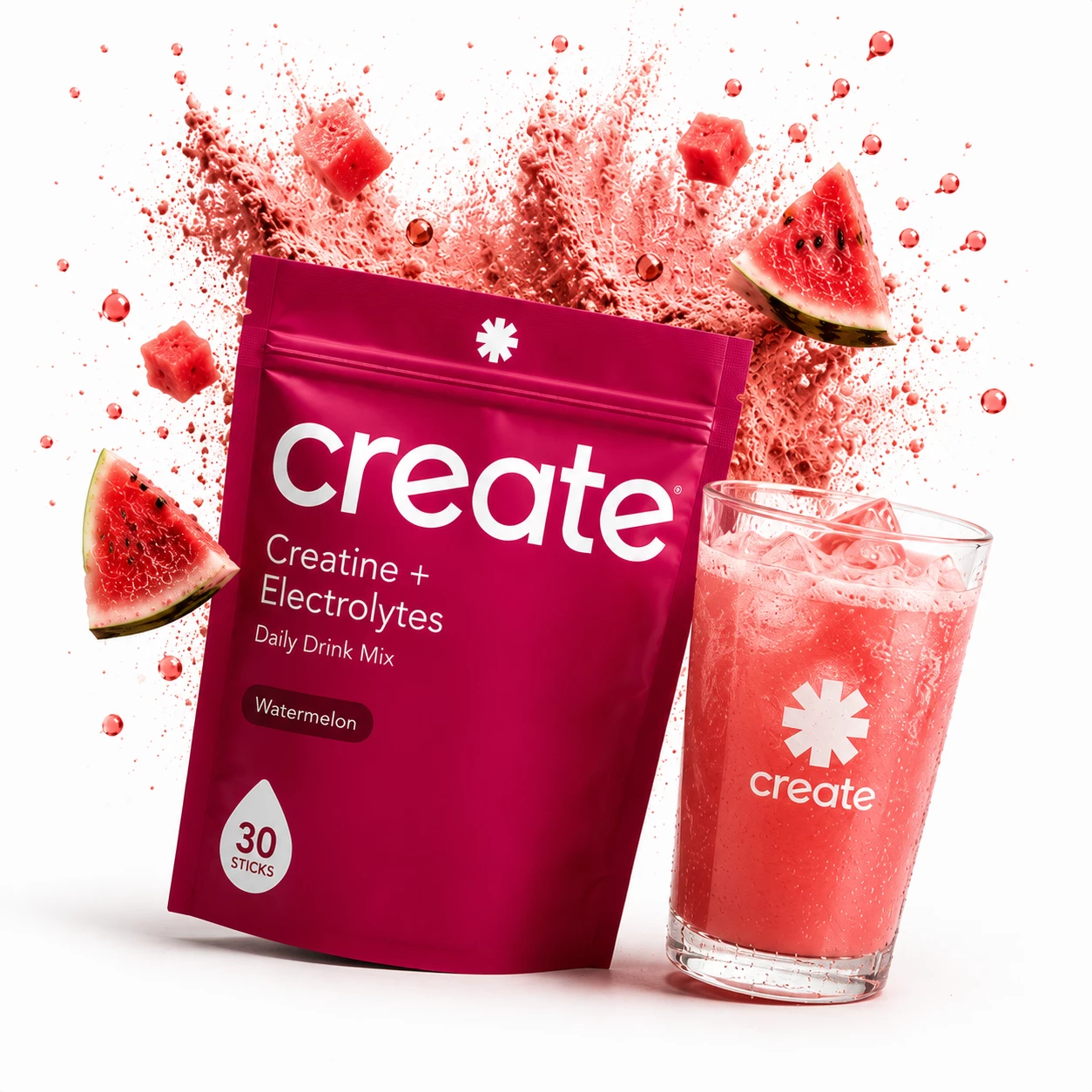
High-Speed Liquid Splash
Strategy: Pairs the primary Watermelon Create pouch with a branded, sweat-beaded glass filled with iced drink mix and the Create star emblem. Floating watermelon cubes, fresh slices, and liquid droplets create a splash surround on a pure white backdrop.
Why it works: Connecting supplement packaging to an iced, refreshing beverage reinforces daily hydration utility. Liquid motion splashes command immediate visual attention on mobile search grids, driving higher Amazon CTR.
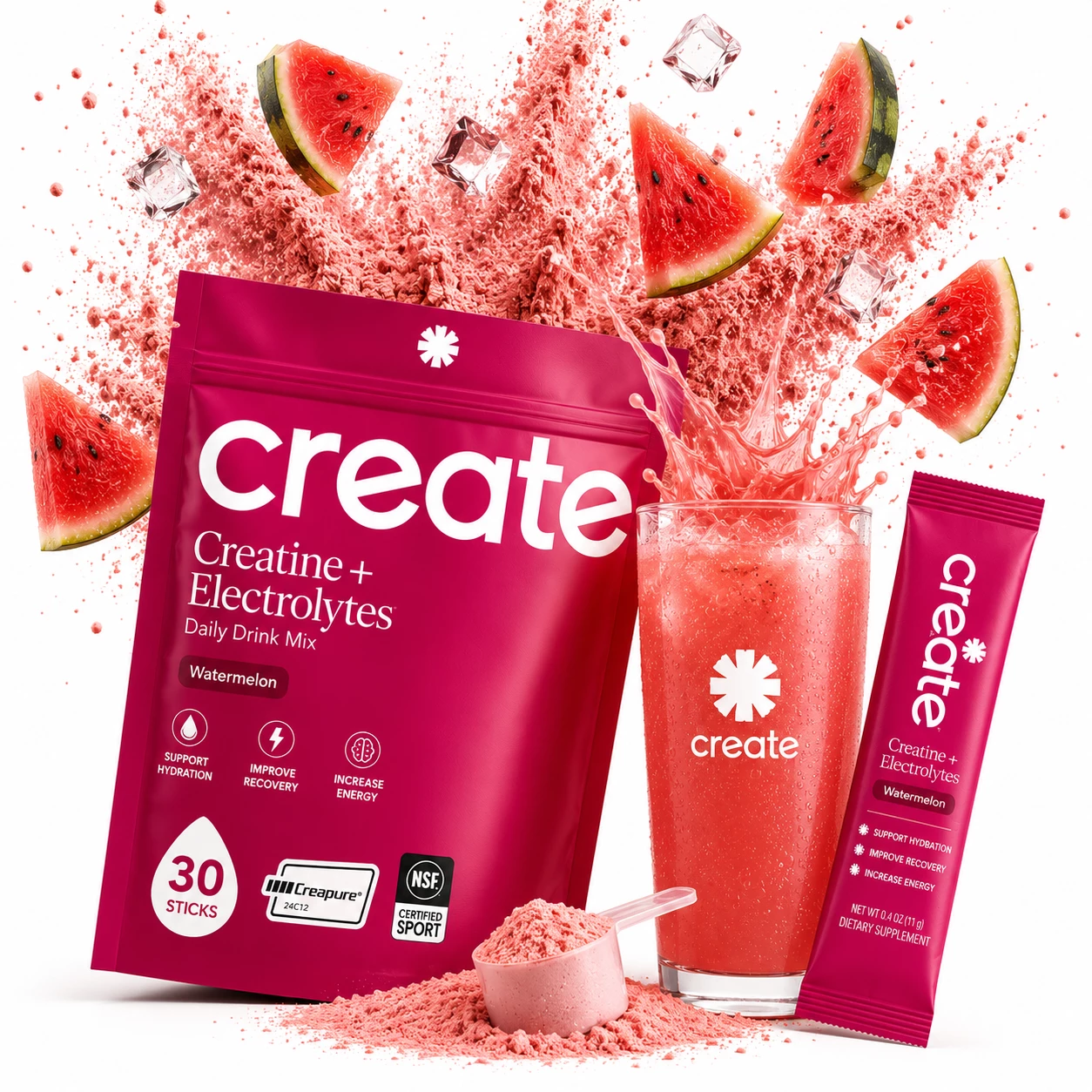
Lab Certification Composite
Strategy: Showcases the Create main pouch featuring Creapure® and NSF Certified Sport® trust badges alongside a filled measuring scoop, single stick pack, and splashing iced drink. Pink powder clouds, floating ice cubes, and watermelon slices frame the top.
Why it works: Combining dosage proof (measuring scoop) with third-party lab certifications directly inside the main image eliminates buyer hesitation before clicking. It proves ingredient quality and purity at first glance.
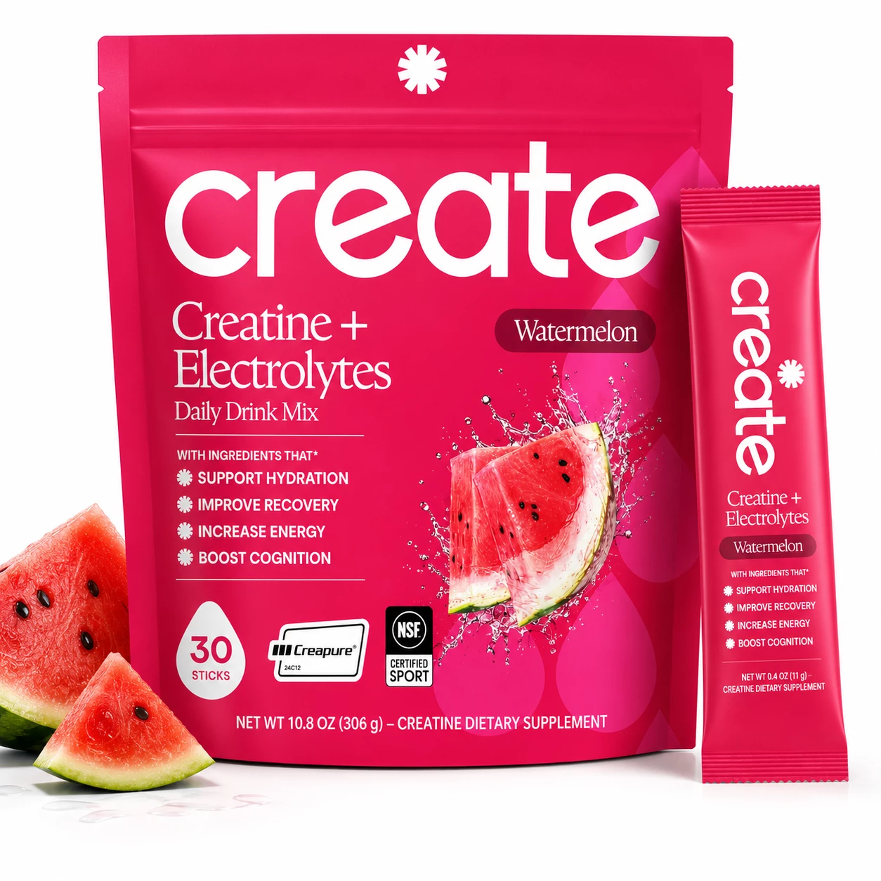
Studio Packaging Baseline
Strategy: A pristine studio layout displaying the 10.8 oz pouch with 4 core benefit callouts (Support Hydration, Improve Recovery, Increase Energy, Boost Cognition), Creapure and NSF badges, and a matching single stick pack next to fresh watermelon slices.
Why it works: Establishes a clean, TOS-compliant control baseline for A/B testing on Amazon. Highlighting clear benefit bullet points and stick pack convenience gives shoppers immediate purchasing clarity.
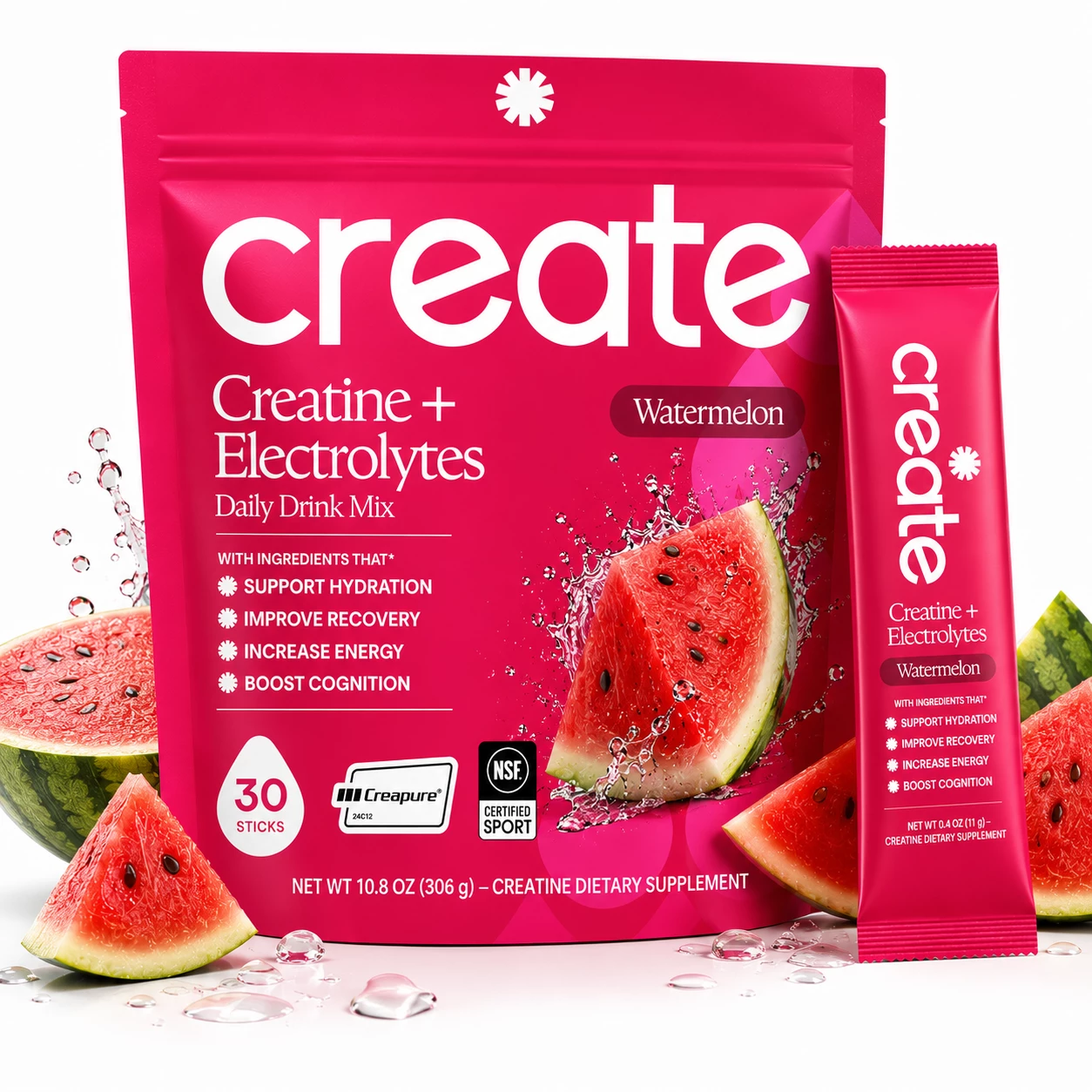
Fresh Fruit Realism
Strategy: Frames the main Create pouch and stick pack with a halved watermelon, fresh wedge, and splashing water droplets. The vibrant green rind and rich red fruit contrast sharply against the magenta packaging.
Why it works: High-contrast natural colors (green rind vs. magenta packaging) create maximum visual pop on Amazon's pure white search background. Fresh fruit realism reassures buyers looking for natural, delicious flavor profiles.
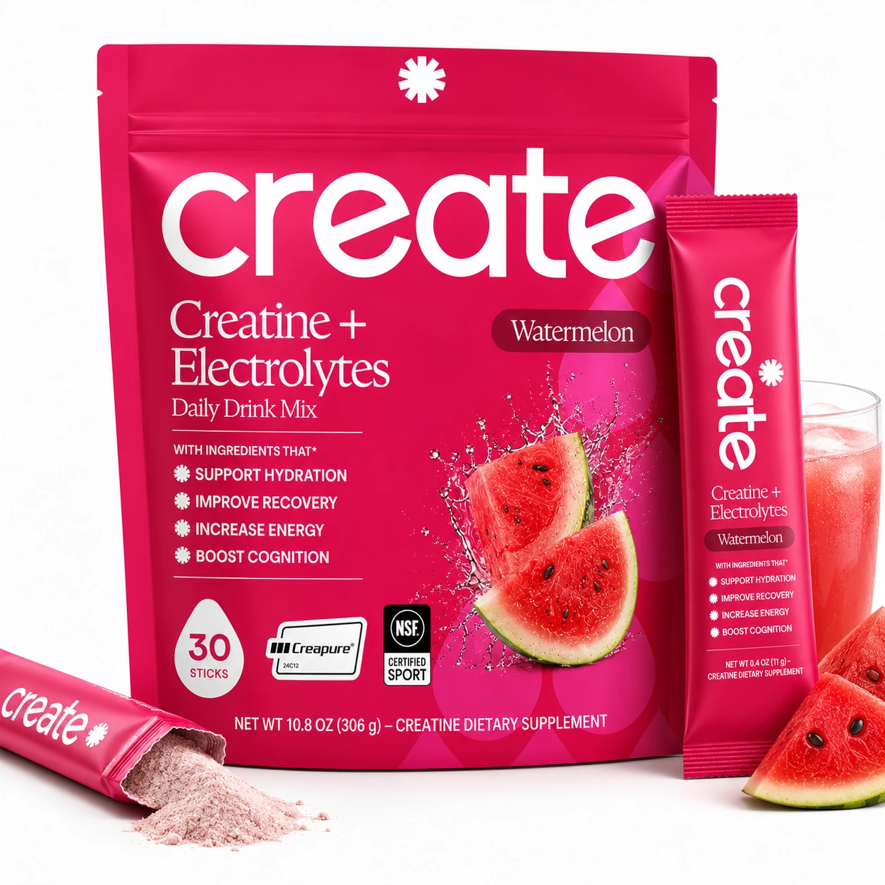
Unboxing Texture Reveal
Strategy: Highlights an opened single stick pack lying in the foreground spilling fine pink creatine powder, alongside the main pouch, a vertical stick pack, an iced glass, and fresh watermelon slices.
Why it works: Showing the actual texture of the unboxed powder proves solubility and fine milling quality. Shoppers want to see what they are buying inside the packaging before making a purchase decision.
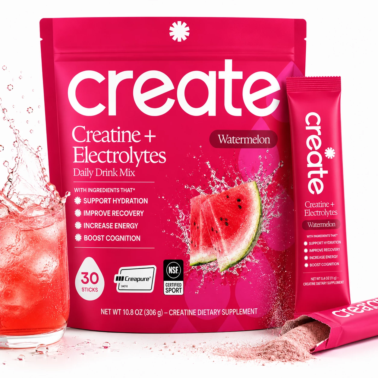
Maximum Frame Fill
Strategy: Integrates an iced drink with dynamic splash on the left, main Create pouch center, vertical stick pack right, and an opened stick pack spilling pink powder in the foreground, filling ~90% of the image canvas.
Why it works: Frame-fill optimization is critical for mobile search grids. Maximizing product size and eliminating dead space ensures the product appears noticeably larger than competitor listings on mobile viewports.
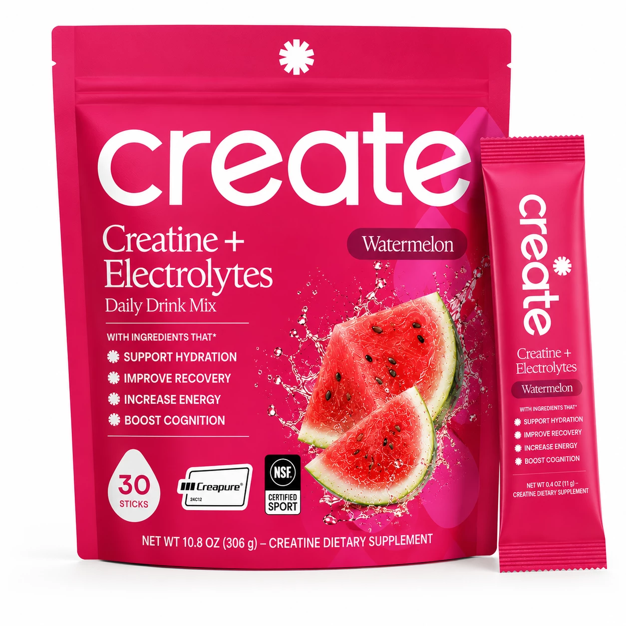
Minimalist Dual Product
Strategy: A high-contrast, distraction-free composite showcasing the main 10.8 oz pouch alongside the single 0.4 oz stick pack on a pure white background, emphasizing crisp packaging typography and trust seals.
Why it works: Minimalist, ultra-focused main images eliminate visual noise for shoppers seeking straightforward product clarity. It provides a clean, TOS-aligned benchmark for split-testing against busy graphics.
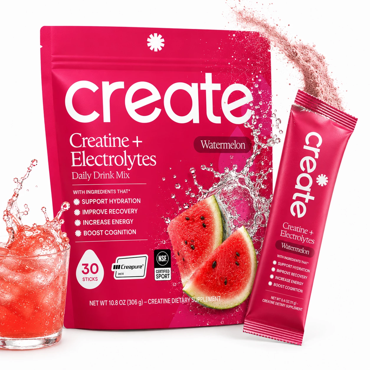
Pouring Powder Motion
Strategy: Captures a single stick pack pouring a stream of fine pink creatine powder into the top, paired with a bubbling glass of iced watermelon drink splashing on the left and the main pouch in the background.
Why it works: Highlighting the pouring motion demonstrates the effortless, mix-and-drink convenience of stick packs. Action visuals capture scrolling attention faster than static packaging photos.
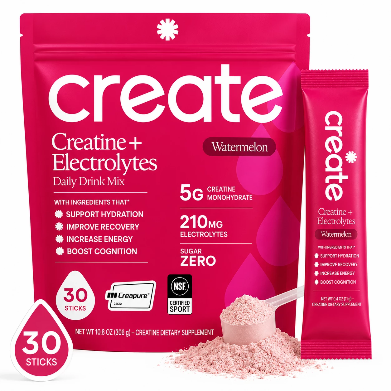
Nutritional Dosage Badges
Strategy: Places prominent dosage callouts—5G CREATINE MONOHYDRATE, 210MG ELECTROLYTES, SUGAR ZERO—directly on the front pouch graphics, alongside a powder scoop, stick pack, and floating '30 STICKS' badge.
Why it works: Amazon buyers actively scan for key ingredient quantities. Displaying 5g Creatine and Zero Sugar prominently on the main image answers top buyer questions instantly, increasing click-through rate.
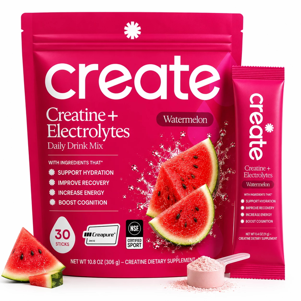
Serving Scoop Baseline
Strategy: Positions the Create main pouch centered with a vertical stick pack on the right, a filled pink powder scoop at the front right base, and a fresh watermelon slice at the front left base.
Why it works: Delivers a balanced, professional presentation combining packaging, single-serving portability, serving scoop measurement, and natural flavor storytelling in one clean hero shot.
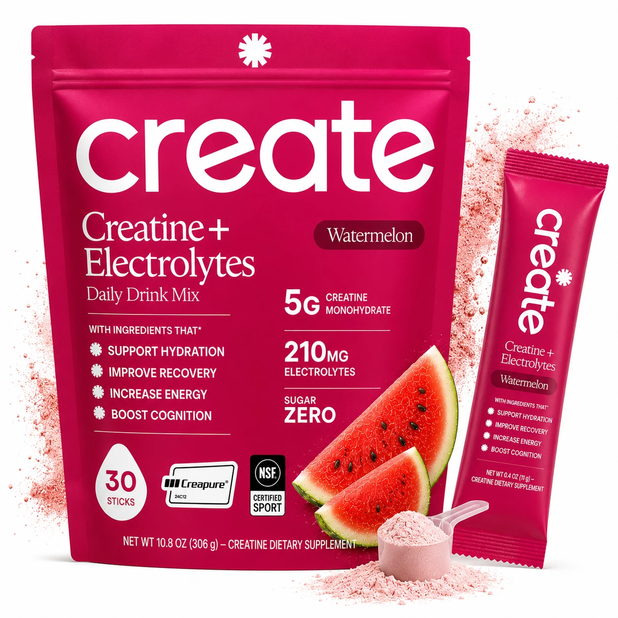
Radiant Powder Cloud Halo
Strategy: Combines bold dosage callouts (5g Creatine, 210mg Electrolytes, Sugar Zero) on the pouch with a radiant pink powder dust halo exploding in the background, a powder scoop, and stick pack.
Why it works: Subtle background powder clouds add energy and premium depth without cluttering the foreground packaging or violating Amazon's white background guidelines.
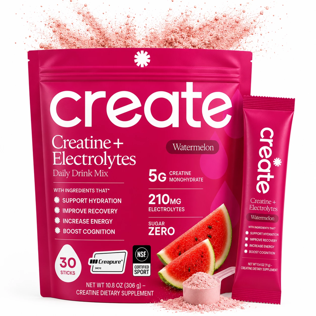
Overhead Powder Burst Crown
Strategy: Features an intense pink creatine powder crown bursting dramatically across the top zipper seal of the pouch, paired with dosage badges, a powder scoop, and fresh watermelon slices.
Why it works: An overhead powder burst creates a strong visual focal point that draws the shopper's eye directly to the brand logo and product title in search results.
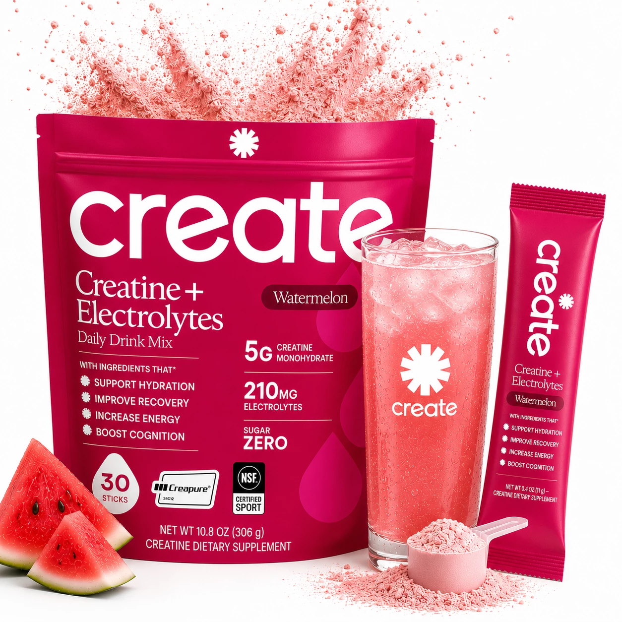
Full Brand Experience Master
Strategy: A comprehensive master composite featuring the main Create pouch with dosage badges, a tall iced branded beverage glass in the foreground, vertical stick pack, filled scoop, and watermelon wedges, topped with an overhead powder burst.
Why it works: The ultimate high-converting composite. It tells the complete product story—dosage, flavor, portable stick format, prepared drink, and trust badges—in a single powerful hero image.
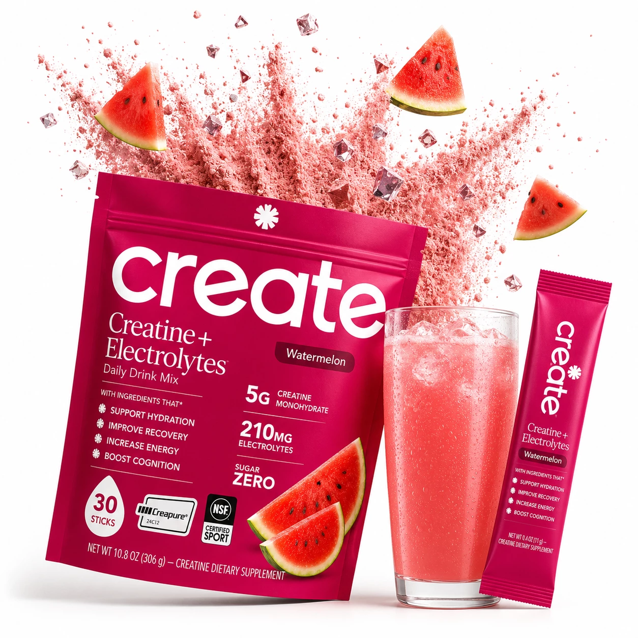
3D Cinematic Angled Pose
Strategy: Positions the main Create pouch at a dynamic angle with dosage specs, flanked by a tall iced glass and stick pack. Overhead, a pink powder blast carries floating watermelon slices and sparkling ice cubes through the air.
Why it works: Combining angled packaging depth with floating ice and fruit creates a 3D cinematic feel that dominates competitor search listings and maximizes mobile click preference.
Want Winning Main Image Strategies for Your Amazon Listing?
The visual conversion results speak for themselves.
We developed these 15 distinct high-converting main image strategies by applying eKom Guy’s systematic CreativeIQ™ optimization framework.
